AFS | Austin Film Society
 AFS | Austin Studios
 AFS | Quentin Tarantino Film Fest
 AFS | Slacker 2011
 AFS | Texas Film Hall of Fame 09
 AIGA | Design Ranch
 AMF | Love Austin Music
 Acran
Acran Alereon
 Alliance Abroad Group
 Arc Reps
 Austin Museum of Art Guild
 Cambridge Friends School
 GirlStart
 H2Hos
H2Hos Internet Police Alliance
 KIRK
KIRK Kinsei
 La Sonrisa Productions | Inside The Circle
 Lake Hills Church
 Marc English Design | Since 1993
 Mass. Association of Bank Council
 Mountain Crossings at Walasi-Yi
 Rancho Pancho
 Sharing Technologies
 Texas Film & Cattle Co.
 Texas Writers Month
 Thokozani
 Troublemaker Studios
 Tsogolo La Thanzi Centre
 UT/Austin | School of Architecture
 Unnatural Axe
 ABC-TV | Healthy Start / Healthy Babies
 ACADIA: Suicide, Sex & Success
 AFS | 20th Retrospective
 AFS | Essential Cinema
 AIGA Atlanta
 AIGA Austin | Love | Work
 AIGA Baltimore
 AIGA Birmingham
  AIGA Boston | Touch of Power
 AIGA Charlotte
  AIGA Honolulu
 AIGA Houston | Doug Sahm
 AIGA Iowa | Fertilizing Minds
 AIGA Las Vegas
 AIGA Miami
 AIGA Nashville
  AIGA Omaha | The Wolves of Texas
 AIGA Philadelphia
 AIGA Washington, D.C.
  Angels You Left
 Art Directors Club of Tulsa
 Auburn University
 BF/VF | Laurie Anderson
 BF/VF | MIra Nair
 Green Room Pictures
 HOW Design Conference 2007
 La Sonrisa Productions | Inside the Circle
 Manufacturing Dissent
 NWAADC Perspective
 NWAADC Step No. 3: O.B.E.
 Quinto Malo Films | One Minute to Nine
 Ransom Center | Avant Garde Film
 Ransom Center | Brit Noir
 Ransom Center | Voyages
 Texas Film Hall of Fame
 Texas Writers Month | 1997 | O. Henry
 Texas Writers Month | 1998 | Porter
 Texas Writers Month | 1999 | McMurtry
 Texas Writers Month | 2000 | McCarthy
 Texas Writers Month | 2001 | Kelton
 Texas Writers Month | 2002 | Carpenter
 Texas Writers Month | 2003 | Dobie
 Texas Writers Month | 2004 | Michener
 Criterion | Border Radio
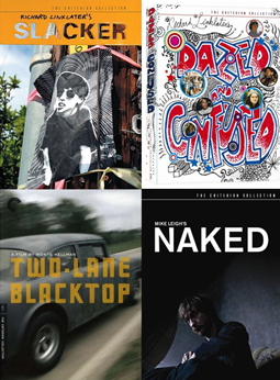
 Criterion | Dazed and Confused
 Criterion | My Own Private Idaho
 Criterion | Naked
 Criterion | Slacker
 Criterion | Two-Lane Blacktop
 Criterion | Walker
 Honora Jacob
 Internet Police Alliance
 Kinsei
 Legacy Trails
 MARK Skateboards | website
 Site59
 AFS | 20th Retrospective
 AFS | Austin Studios brochure
 AFS | Texas Film Hall of Fame
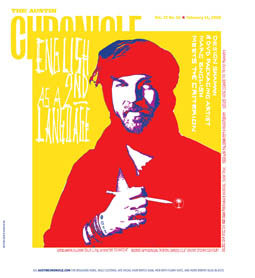
 Austin Chronicle | English: 2nd Language
 Austin Film Society | PoV
 Austin Museum of Art Guild
 Chronicle Books | Cooking Up A Storm
 Chronicle Books | Where Flavor Was Born
 City of Austin | Create Austin Cultural Plan
 Four Hands
 Houghton Mifflin | About Language
 Indigenous Art of Coahuila
 Inspirational Hollywood
 Massachusetts College of Art | Compton
 Meta Design
 Rockport Publishers | Designing Identity
 Texas Fine Art Association | Pulp Fictions
 Texas Fine Arts Association
 Texas Writers Month
 The Art of Beowulf
 UT Department of Education
 UTSoA | Planning Forum
 Vtel
Vtel Xetel Corporation
  AFS | Essential Cinema
 AFS | Fundraising Invitation
 AFS | Make Watch Love Film
 Arts Alliance America | Inning By Inning
 Booker Music | Craig Hella Johnson
  Boston Brownies
 Criterion | Border Radio
 Criterion | Dazed and Confused
 Criterion | Naked
 Criterion | Slacker
 Criterion | Two-Lane Blacktop
 Criterion | Walker
 Dr. Dreams Juice Machine
 LOL
LOL La Peste
 MARK Skateboards | decks
 Merchants of Venus
 The Good Seeds
  The Stains
 Two Mule Records
 Whole Foods Market | 365 Pasta | bag
 Whole Foods Market | 365 Pasta | box
 Whole Foods Market | Belgian Chocolates
 Whole Foods Market | Pasta
 Whole Foods Market | Pasta family
 Whole Foods Market | Seasonal Specialties
 Whole Foods Market | Truffles
14 February 2008 | Marc Savlov | Austin Chronicle
I've been here plenty of times before, but I still feel the urge to stop and check myself whenever I walk into the studio-cum-office of Marc English Design, because in truth, this sudden border crossing is like stepping out of the everyday and into a more acutely realized reality.
This isn't an office; it's a Rorschach test that got caught in the crossfire between Angel Eyes and Tuco. It's the good, the bad, and the ugly-gorgeous, all wrapped up in a single identity, a brand that not only defines the artist and his art but leaves a lasting, lovely scar to boot. It sears you. Honest art leaves marks.
Everything is everywhere: A sprawling, chromatically grating gig poster announcing the Clash's June '81 Bond's Casino show in NYC threatens three chords and the truth against a vintage one-sheet for Sergio Leone's
Books, tattered, well-thumbed, and loved to the quick, are piled, stacked, strewn about: Gardener's
This glorious, hypercreative cavalcade of all things Marc English - his lifetime essence, outlandish explanation, and never-ending quest to discover as much cool as his soul can hold - is as clear a glimpse into the soul of self-described "design shaman" Marc English as anyone with half a mind and a working knowledge of midnight fancies and south-of-the-border (any border) rambles could ever bear. Really, you might want to wear a welder's visor and some chain mail just to be on the safe side; in his hands, "design theory" is a radical, insurrectionist weapon. Joe Strummer would've dug this cat, but good.
And speaking of that late, lamented combat rocker, Strummer, oddly enough, turns up - briefly in the flesh, frequently on the soundtrack - in English's newest design job, the packaging for the new Criterion Collection edition of a nearly forgotten slice of thrillingly mad filmmaking called, simply, Walker.
----------------
"No one will remember Walker," says Peter Boyle's conniving Cornelius Vanderbilt of Ed Harris' manifest-destiny-driven yanqui imperialist running dog and real-life soldier of fortune, William Walker, in Alex (Repo Man) Cox's spectacularly misunderstood 1987 film
Not so fast, Moneybags. Cox's pseudo-historical bloodbath epic is finally getting its DVD-due in a remixed, remastered, bells, whistles, and commentaries ne plus ultra Criterion Collection edition that's arriving in stores Feb. 19. And regardless of what you may think of that film's surreal, Peckinpah-meets-Gilliam take on the Walker mythos, one thing is already inarguable: From a design standpoint, Criterion's Walker will suck your eyes right out of your head and its retail price right out of your pocket. It's worth it, every penny. And for that, you can thank/blame Austin-based graphic designer Marc English of Marc English Design.
To be sure, fans of Cox, Harris, and a post-Clash Strummer have just cause for imminent revelry, but what's really - and instantly - remarkable here is English's cunning, audacious graphic design. (See cover art, along with a review of the Criterion release, at right.) Composed of a pop-arty pic of Harris portraiture atop a field of dusky crimson, with archival, period text visible beneath and jagged blue, kinetic outbursts radiating from behind, Criterion's Walker should be filed under "O" for "ordnance." It looks less like a DVD package and more like a dark promise of revolution, a lesson in chaos, and, above all, a real-life, based-on-a-true-story story. It's English's version of the Clash's Sandinista! pared down to its rebellious visual quick: Viva Nicaragua! Viva la Revolucion!
English's seabed talents as graphic designer, filmmaker, writer, teacher, and general renaissance cowpoke-cum-illustrator man are no secret among Austin's multidisciplined art and design communities, but few may have realized that the man has made one of the most treacherous crossroads of all time, that of commerce and art, his designated moving-picture specialty (although, as English himself stresses, his forays into DVD design are far from the only things he does).
At last count, English has notched no fewer than seven Criterion Collection design gigs on his bedpost gun belt, beginning with Austin Film Society cohort Richard Linklater's
Alone amidst all of Criterion's top-shelf rediscoveries, 1971's
---------------------
It stars (other than the cars and the road) Warren Oates as GTO, in a monumentally cipheric performance as woeful, pathetic obfuscation personified, and James Taylor and Beach Boy Dennis Wilson as the Driver and the Mechanic of that howling '55 Chevy, with talky, too-soon-dead Laurie Bird as the Girl who comes - not so much between them as beyond them - a stoney, roadster thumb-babe whose bleak, matter-of-fact lustfulness corrodes the road like battery acid leaking from a sprung DieHard.
The packing is English's coup de grace, a perfectionist, minimalist design job that tweaks the borderline existentialism of the film right into the packaging. But don't take our word for it: Hellman was so impressed by the Criterion/English treatment his film received that he promptly went out and bought a massive, 50-inch television to screen it on.
"As of last week, it's gone into a fifth pressing," says Hellman, by phone from L.A., noting that not only is that unusual for a cult film whose only previous DVD release (from Anchor Bay) is long out of print but much of that is due in no small part to English's design, which smartly mimics the spare, clean lines of Hellman's rocketing road-to-nowhere odyssey.
"His work just exemplifies Criterion's style in that it catches your eye immediately," enthuses Hellman. "It's so different from any other company's DVD product that it's like it's from a totally other world. From a director's standpoint, I don't think that anyone imagines that a film they make is going to be alive and well after almost 40 years, and certainly when it was made, nobody envisioned that anybody would be looking at it with fresh eyes almost 40 years later. When we were doing the color correction on it, I realized, wow, this is a whole 'nother world. I'm just really overwhelmed by Marc's work on the design. I think it's one of the most gorgeous packaging jobs I've ever seen. I just like everything about it."
-----------------
Five things you may not know about Marc English:
1) He has incorporated his daughter Rebecka's name into the packaging of every one of his DVD designs. Go look for it.
2) He has a penchant for Venn diagrams, the better to discover the hidden connections between story and storyteller, art and point of sale.
3) He trusts his interns implicitly.
4) A former Bostonian before his move to Austin in 1995, he still has the remnants of his Southie accent, which bubble to the surface whenever he says the word "however," rendering it "howevah."
5) He once rode a camel through the eye of a needle in the Sahara.
------------------
So, okay, that last one might be a case of John Ford's
Half of what comes out of Marc English's mouth sounds a wee bit like finely tuned hyperbole hucksterism, self-mythologizing but never self-absorbed.
His identity both as a human being and an artist is XXL life. Austin filmmaker/writer Cary Roberts has rightly called him "the Stanley Kubrick of design." He fairly burns with passion for his life and work, and he wants you to burn, too. No sparks or embers here. English is a conflagration of design theory, overwhelming talent, and experimentalism, and his work with Criterion meets at the dirty crossroads of the artistic truth of what has been entrusted to him and the bottom line, the movement of "product," the allure of the dream made cardboard, laser-encoded plastic discs, at midnight, beneath a full moon, with pistols and blood well spent. His aim is truest.
The art of DVD design is, for most of those assigned to "move product," as a rule, pretty disposable stuff. Criterion is one of the few exceptions to that rule, where the designer is encouraged not only to use a film's packaging as a means to be creative with an eye toward moving a product but also to view the design as an extension of the storytelling process.
Case in point: Criterion's 2004 release of Richard Linklater's iconic
"When I sat down with Rick to discuss ideas for
Creatively unleashed, English's first DVD gig remains his most personal and most iconoclastic – not only does it complement Linklater's film, it enhances it, adding, in the form of menu options, artwork, and attitude, a completely new but wholly recognizable DIY echo of
"From a corporate identity standpoint," English explains, "the existing Slacker logo had a certain amount of equity, so I didn't want to mess with it too much. What I did was take the iconic image of Pap smear girl [Teresa Taylor], print it out on a laser printer, soak it in water to make it look beat, duct-tape it to a telephone pole, and then just hold a stencil of the title up in front of it and shoot the whole thing in camera. Which created an instant extension of the film's DIY edge. And then as far as the interior design of the DVD, we spray-painted the menus out back of my house, and the pictures on discs themselves are the manhole covers from outside of my office - they have the word "Austin" on them - because the film Slacker is of the street, right? It made sense to try and capture as much Austin in the design of the DVD as possible so that someone who was not from here would be fully immersed."
The end result so impressed both Linklater (who later handed Criterion's
"As long as I can remember," adds English, "I've been using this Zen phrase I picked up: 'Let it be what it wants to be.' That's always what it's about. When I did the
Looking over the assorted imagery that served as the basis for English's design for
It was, as ever, a means to an end, with that end being the furthering and/or distillation of the film's storyline. Since
"I like to humor myself," he says, "by pretending that I wrote a letter to all my corporate clients saying: 'From now on I refuse to do corporate work. I will only do work that I care about. No more widgets. No more annual reports for widget factories. From now on I will only be dealing with Things That Matter, like film and literature and music and culture.' Of course, I don't have any clients that would merit such a letter, but that's where my head is at these days. Great clients make great design, DVD or otherwise, and, ultimately, my job is to authentically tell somebody else's story. My responsibility is to the stories of other people and to finding a way to encapsulate them, in amber, if you will."
Consider then the story of William Walker, not forgotten at all, but retold, visually, strikingly, alongside those of Hellman's Driver and Mechanic, Linklater's dazed and confused high schoolers, and all the others yet to learn English as a second language: 400 cc, all-guns-blazing art for art's sake, a cool, clean package surrounding a bomb in your DVD player. Watch and learn and then - why not? - dream and do and hit the road, if only for one more time.