 AFS | Austin Film Society
 AFS | Austin Studios
 AFS | Quentin Tarantino Film Fest
 AFS | Slacker 2011
 AFS | Texas Film Hall of Fame 09
 AIGA | Design Ranch
 AMF | Love Austin Music
 Acran
Acran Alereon
 Alliance Abroad Group
 Arc Reps
 Austin Museum of Art Guild
 Cambridge Friends School
 GirlStart
 H2Hos
H2Hos Internet Police Alliance
 KIRK
KIRK Kinsei
 La Sonrisa Productions | Inside The Circle
 Lake Hills Church
 Marc English Design | Since 1993
 Mass. Association of Bank Council
 Mountain Crossings at Walasi-Yi
 Rancho Pancho
 Sharing Technologies
 Texas Film & Cattle Co.
 Texas Writers Month
 Thokozani
 Troublemaker Studios
 Tsogolo La Thanzi Centre
 UT/Austin | School of Architecture
 Unnatural Axe
 ABC-TV | Healthy Start / Healthy Babies
 ACADIA: Suicide, Sex & Success
 AFS | 20th Retrospective
 AFS | Essential Cinema
 AIGA Atlanta
 AIGA Austin | Love | Work
 AIGA Baltimore
 AIGA Birmingham
  AIGA Boston | Touch of Power
 AIGA Charlotte
  AIGA Honolulu
 AIGA Houston | Doug Sahm
 AIGA Iowa | Fertilizing Minds
 AIGA Las Vegas
 AIGA Miami
 AIGA Nashville
  AIGA Omaha | The Wolves of Texas
 AIGA Philadelphia
 AIGA Washington, D.C.
  Angels You Left
 Art Directors Club of Tulsa
 Auburn University
 BF/VF | Laurie Anderson
 BF/VF | MIra Nair
 Green Room Pictures
 HOW Design Conference 2007
 La Sonrisa Productions | Inside the Circle
 Manufacturing Dissent
 NWAADC Perspective
 NWAADC Step No. 3: O.B.E.
 Quinto Malo Films | One Minute to Nine
 Ransom Center | Avant Garde Film
 Ransom Center | Brit Noir
 Ransom Center | Voyages
 Texas Film Hall of Fame
 Texas Writers Month | 1997 | O. Henry
 Texas Writers Month | 1998 | Porter
 Texas Writers Month | 1999 | McMurtry
 Texas Writers Month | 2000 | McCarthy
 Texas Writers Month | 2001 | Kelton
 Texas Writers Month | 2002 | Carpenter
 Texas Writers Month | 2003 | Dobie
 Texas Writers Month | 2004 | Michener
 Criterion | Border Radio
 Criterion | Dazed and Confused
 Criterion | My Own Private Idaho
 Criterion | Naked
 Criterion | Slacker
 Criterion | Two-Lane Blacktop
 Criterion | Walker
 Honora Jacob
 Internet Police Alliance
 Kinsei
 Legacy Trails
 MARK Skateboards | website
 Site59
 AFS | 20th Retrospective
 AFS | Austin Studios brochure
 AFS | Texas Film Hall of Fame
 Austin Chronicle | English: 2nd Language
 Austin Film Society | PoV
 Austin Museum of Art Guild
 Chronicle Books | Cooking Up A Storm
 Chronicle Books | Where Flavor Was Born
 City of Austin | Create Austin Cultural Plan
 Four Hands
 Houghton Mifflin | About Language
 Indigenous Art of Coahuila
 Inspirational Hollywood
 Massachusetts College of Art | Compton
 Meta Design
 Rockport Publishers | Designing Identity
 Texas Fine Art Association | Pulp Fictions
 Texas Fine Arts Association
 Texas Writers Month
 The Art of Beowulf
 UT Department of Education
 UTSoA | Planning Forum
 Vtel
Vtel Xetel Corporation
  AFS | Essential Cinema
 AFS | Fundraising Invitation
 AFS | Make Watch Love Film
 Arts Alliance America | Inning By Inning
 Booker Music | Craig Hella Johnson
  Boston Brownies
 Criterion | Border Radio
 Criterion | Dazed and Confused
 Criterion | Naked
 Criterion | Slacker
 Criterion | Two-Lane Blacktop
 Criterion | Walker
 Dr. Dreams Juice Machine
 LOL
LOL La Peste
 MARK Skateboards | decks
 Merchants of Venus
 The Good Seeds
  The Stains
 Two Mule Records
 Whole Foods Market | 365 Pasta | bag
 Whole Foods Market | 365 Pasta | box
 Whole Foods Market | Belgian Chocolates
 Whole Foods Market | Pasta
 Whole Foods Market | Pasta family
 Whole Foods Market | Seasonal Specialties
 Whole Foods Market | Truffles
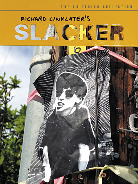
"It's been 14 years in the making, but the film that planted Austin on the topography of the national consciousness has finally arrived on DVD in an appropriately, gloriously bells 'n' whistles package from the Criterion Collection, in an equally gorgeous package courtesy of
local design guru Marc English of Marc English Design."
Marc Savlov
The Austin Chronicle
Richard Linklater's first major film defined a term, a generation, and left an indelible mark on a city now known as a film town. For us, an opportunity to dig into what we know best: Let it be what it wants to be.
Linklater's films are known for their writing, their words, how people interact. While the the film is in continuous motion, it is the dialogue that drives it. It was a no-brainer to litter the book with lines from the film, sometimes randomly, sometimes in conjunction with specific art. One could argue that you could step into the film at any point, as there is no plot. Same goes for the book - the pages are part of a whole, but each lives on its own.
From the first it made sense to use the original logo and the best-known character (Madonna pap-smear woman, as she's called), who had been used in the original promo. Personally, I couldn't stand the image - there were other characters I preferred. But its not my film, and again, you have to be aware of the audience. So we got subversive - which only made sense, as there are a few times in the film where the characters - the slackers - are talking about bucking the system. So we joined in.
For the most part, every time we needed the logotype, it was based on a rude foamcore stencil. We printed out the original, taped it to foamcore and just cut straight thru, with a dull blade. Why change it? Be a slacker. Then we spray painted the foamcore yellow, (when the film was released on video, back in the 90s, a companion b&w book was published. both book and vid packaging used yellow, so we picked up on that) and holding it against a variety of exterior surfaces used it as our titlecard. And we used the shadows it created in camera (Nikon D320 digital), the leftover forms we'd cut out, and even spraypainted the stencil behind our office so as to have it on concrete.
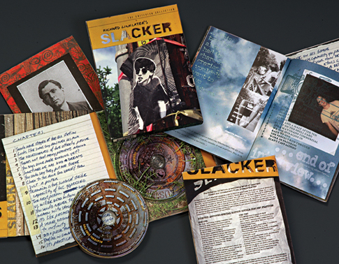
And when it came to using pap-smear gal, we stapled a laser print of her to a telephone pole, after having soaked it in water, and then drying it -instant weathering. With that image and our hand-held template, we had a cover. Of course using pap-smear gal came after a suggestion from Criterion after they'd seen - and loved - one of our original ideas: the title-card against a close-up of a staple ridden telephone pole. We'd presented other versions of the card, with the card reflected in puddles, held up against the sky that the natural ambience of sunny Austin literally came thru the stencil. We knocked out a few dozen variations, before locking on the inclusion of pap-smear gal. When working on projects that have several components, I can't stand each piece being identical, so we had the opportunity to use some of our early ideas. The cover of the digipac which houses the disks is just the close-up of the pole, with the titlecard; the shadow created by the stencil shows up in the book as the title page.
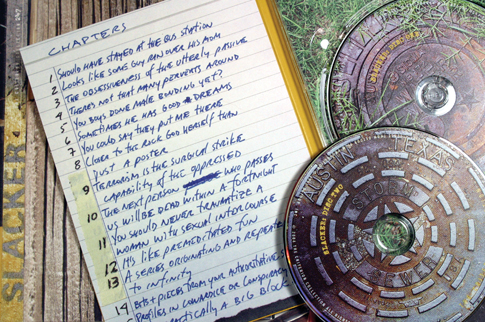
Design associate Bart Kibbe, and I roamed the streets near our office photographing numbers that we found on telephone poles, utility boxes, stenciled on curbs, which we used for pagination (we didn't number every page, adding to the slacker quality). Afterward, Bart suggested we use the manhole covers which we'd shot, for the actual disks. Bingo. Perfect. Credit where credit is due. It doesn't get more Austin, or street, than the manhole covers 25" from our studio. We faked the spraypainted logo on them as I couldn't bring myself to mess up the neighborhood. South Austin is a whole 'nother world. We've helped bring that Austin experience to life.
For more see the article that came out in Step Inside Design, Take It Personally.