AFS | Austin Film Society
 AFS | Austin Studios
 AFS | Quentin Tarantino Film Fest
 AFS | Slacker 2011
 AFS | Texas Film Hall of Fame 09
 AIGA | Design Ranch
 AMF | Love Austin Music
 Acran
Acran Alereon
 Alliance Abroad Group
 Arc Reps
 Austin Museum of Art Guild
 Cambridge Friends School
 GirlStart
 H2Hos
H2Hos Internet Police Alliance
 KIRK
KIRK Kinsei
 La Sonrisa Productions | Inside The Circle
 Lake Hills Church
 Marc English Design | Since 1993
 Mass. Association of Bank Council
 Mountain Crossings at Walasi-Yi
 Rancho Pancho
 Sharing Technologies
 Texas Film & Cattle Co.
 Texas Writers Month
 Thokozani
 Troublemaker Studios
 Tsogolo La Thanzi Centre
 UT/Austin | School of Architecture
 Unnatural Axe
 ABC-TV | Healthy Start / Healthy Babies
 ACADIA: Suicide, Sex & Success
 AFS | 20th Retrospective
 AFS | Essential Cinema
 AIGA Atlanta
 AIGA Austin | Love | Work
 AIGA Baltimore
 AIGA Birmingham
  AIGA Boston | Touch of Power
 AIGA Charlotte
  AIGA Honolulu
 AIGA Houston | Doug Sahm
 AIGA Iowa | Fertilizing Minds
 AIGA Las Vegas
 AIGA Miami
 AIGA Nashville
  AIGA Omaha | The Wolves of Texas
 AIGA Philadelphia
 AIGA Washington, D.C.
  Angels You Left
 Art Directors Club of Tulsa
 Auburn University
 BF/VF | Laurie Anderson
 BF/VF | MIra Nair
 Green Room Pictures
 HOW Design Conference 2007
 La Sonrisa Productions | Inside the Circle
 Manufacturing Dissent
 NWAADC Perspective
 NWAADC Step No. 3: O.B.E.
 Quinto Malo Films | One Minute to Nine
 Ransom Center | Avant Garde Film
 Ransom Center | Brit Noir
 Ransom Center | Voyages
 Texas Film Hall of Fame
 Texas Writers Month | 1997 | O. Henry
 Texas Writers Month | 1998 | Porter
 Texas Writers Month | 1999 | McMurtry
 Texas Writers Month | 2000 | McCarthy
 Texas Writers Month | 2001 | Kelton
 Texas Writers Month | 2002 | Carpenter
 Texas Writers Month | 2003 | Dobie
 Texas Writers Month | 2004 | Michener
 Criterion | Border Radio
 Criterion | Dazed and Confused
 Criterion | My Own Private Idaho
 Criterion | Naked
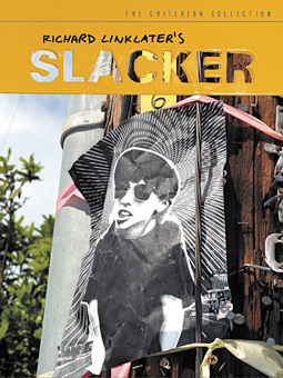
 Criterion | Slacker
 Criterion | Two-Lane Blacktop
 Criterion | Walker
 Honora Jacob
 Internet Police Alliance
 Kinsei
 Legacy Trails
 MARK Skateboards | website
 Site59
 AFS | 20th Retrospective
 AFS | Austin Studios brochure
 AFS | Texas Film Hall of Fame
 Austin Chronicle | English: 2nd Language
 Austin Film Society | PoV
 Austin Museum of Art Guild
 Chronicle Books | Cooking Up A Storm
 Chronicle Books | Where Flavor Was Born
 City of Austin | Create Austin Cultural Plan
 Four Hands
 Houghton Mifflin | About Language
 Indigenous Art of Coahuila
 Inspirational Hollywood
 Massachusetts College of Art | Compton
 Meta Design
 Rockport Publishers | Designing Identity
 Texas Fine Art Association | Pulp Fictions
 Texas Fine Arts Association
 Texas Writers Month
 The Art of Beowulf
 UT Department of Education
 UTSoA | Planning Forum
 Vtel
Vtel Xetel Corporation
  AFS | Essential Cinema
 AFS | Fundraising Invitation
 AFS | Make Watch Love Film
 Arts Alliance America | Inning By Inning
 Booker Music | Craig Hella Johnson
  Boston Brownies
 Criterion | Border Radio
 Criterion | Dazed and Confused
 Criterion | Naked
 Criterion | Slacker
 Criterion | Two-Lane Blacktop
 Criterion | Walker
 Dr. Dreams Juice Machine
 LOL
LOL La Peste
 MARK Skateboards | decks
 Merchants of Venus
 The Good Seeds
  The Stains
 Two Mule Records
 Whole Foods Market | 365 Pasta | bag
 Whole Foods Market | 365 Pasta | box
 Whole Foods Market | Belgian Chocolates
 Whole Foods Market | Pasta
 Whole Foods Market | Pasta family
 Whole Foods Market | Seasonal Specialties
 Whole Foods Market | Truffles
5 W's by Matthew Porter
[Step Inside Design, November | December 2004]
Who
Marc English is an acquired taste. Kind of like unfiltered Camels, jalapeno peppers and tequila for breakfast. This writer first got a "taste" of English when I saw and heard him clank into a room at AIGA Austin's infamous Design Ranch wearing more metal and leather than Mad Max while performing a version of that kitsch Kuntry classic, Turkey in the Straw, that made everyone ashamed of themselves. But, like a lot of things you shouldn't have, once you've had a little snort of English, you're kind of hooked. He's the closest thing we have in AIGA to Johnny Cash. He adopted Austin as his home and milieu ten years ago and has subsumed its cultural and visual language. As a board member of the Austin Film Society English came to know writer-director Richard Linklater, creator of the cult favorite, Slacker, which was filmed in and premiered in Austin in 1991. Criterion specializes in gathering great films from around the world and publishing them in editions of high technical quality with award-winning, original supplements. The company decided to assemble such a package for Slacker's many fans. Linklater encouraged them to use English because a.) He understood Linklater b.) He understood the film and c.) He understood Austin's funky culture.
What
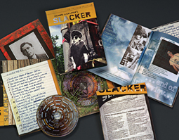
When asked if it was unusual to have an elaborate package design for a film that cost only about $25,000 to make, English was thoughtful: "Unusual for most, not for them [The Criterion Collection]," says English. "These are the collectible editions that get even the directors, cinematographers, writers, et cetera, excited. They put a lot into their products by adding extensive archival materials, scholarly commentaries, early shorts, shooting scripts, interviews, and essays - the works. With a portfolio of films by Truffault, Kurosawa, Fellini, Fassbinder, Bergman, Scorsese, Bunuel - a who's who of great directors - they have to fashion packages that reflect that level of greatness. Sure, it's a movie about slackers but it is also the first low-budget indie to make a huge impact on American film - it was a standard bearer. The design had to capture the essence of that history and the rich, odd personality of the film itself."
Where
Slacker was filmed in Austin, Texas. Richard Linklater, as well as Marc English, live and work in the city today. In looking for material to use in the design, English - as principal photographer - and his assistant, Bart Kibbe roamed the streets of Austin over several days, seeing how the environment could be used as a design element. In the film, the setting plays the role of a principal actor (there are 100+ different, interrelated characters featured in the film). In the design, Austin doesn't simply become the backdrop - it becomes the star.
How
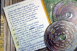
The studio created custom art for every on-screen menu, utilizing appropriate materials (duct tape, cardboard, labels, flyers, dirty plates, spray paint, guitar cases, corrugated tin), which required more production effort on the part of client Criterion, than designing the standard formatted template. English used a CANON EOS-D60 digital to shoot much of the art (archive materials were supplied by the director) and used a raw, hand-cut foam stencil to make the logotype, even spraying it on the asphalt behind his office. The famous "Pap Smear Pusher" (this woman tries to sell Madonna's pap smear tab and a sample pubic hair in the film and her image was used in the film's original one sheets, etc.) was printed off at the office, wrinkled, sprayed with water, then dried and affixed to a telephone pole. Viola! Instant indie fake guerrilla marketing promo.
When
As mentioned, the film debuted in 1991 and saw a short but successful run in art house theatres from New York to Los Angeles. Shortly after it, other low-budget indie films began to capture the imagination of film enthusiasts and the interest of distributors. English, with his assistants, Bart Kibbe and Michael Nowlin, shot all the art that appears in the on-screen menus, the DVD sleeve, the 68-page book and the DVD disc faces on several scorching June days this summer. The Criterion Collection released the package for sale in September of 2004.
Why
English explains it best: "The film is a cult fave, and has been since its release. Add to that the film geeks, cineastes and filmmakers, and you've got a crowd. I would think that as writers have certain books on their shelves, musicians certain albums, filmmakers would have this as reference. As for the concept for the packaging, Linklater's films are known for their writing, their words, how people interact. It was a no-brainer to litter the book with lines from the film, sometimes randomly, sometimes in conjunction with specific art. One could argue that you could step into the film at any point, as there is no plot. Same goes for every aspect of this project - they are part of a whole, but each can exist on its own."