AFS | Austin Film Society
 AFS | Austin Studios
 AFS | Quentin Tarantino Film Fest
 AFS | Slacker 2011
 AFS | Texas Film Hall of Fame 09
 AIGA | Design Ranch
 AMF | Love Austin Music
 Acran
Acran Alereon
 Alliance Abroad Group
 Arc Reps
 Austin Museum of Art Guild
 Cambridge Friends School
 GirlStart
 H2Hos
H2Hos Internet Police Alliance
 KIRK
KIRK Kinsei
 La Sonrisa Productions | Inside The Circle
 Lake Hills Church
 Marc English Design | Since 1993
 Mass. Association of Bank Council
 Mountain Crossings at Walasi-Yi
 Rancho Pancho
 Sharing Technologies
 Texas Film & Cattle Co.
 Texas Writers Month
 Thokozani
 Troublemaker Studios
 Tsogolo La Thanzi Centre
 UT/Austin | School of Architecture
 Unnatural Axe
 ABC-TV | Healthy Start / Healthy Babies
 ACADIA: Suicide, Sex & Success
 AFS | 20th Retrospective
 AFS | Essential Cinema
 AIGA Atlanta
 AIGA Austin | Love | Work
 AIGA Baltimore
 AIGA Birmingham
  AIGA Boston | Touch of Power
 AIGA Charlotte
  AIGA Honolulu
 AIGA Houston | Doug Sahm
 AIGA Iowa | Fertilizing Minds
 AIGA Las Vegas
 AIGA Miami
 AIGA Nashville
  AIGA Omaha | The Wolves of Texas
 AIGA Philadelphia
 AIGA Washington, D.C.
  Angels You Left
 Art Directors Club of Tulsa
 Auburn University
 BF/VF | Laurie Anderson
 BF/VF | MIra Nair
 Green Room Pictures
 HOW Design Conference 2007
 La Sonrisa Productions | Inside the Circle
 Manufacturing Dissent
 NWAADC Perspective
 NWAADC Step No. 3: O.B.E.
 Quinto Malo Films | One Minute to Nine
 Ransom Center | Avant Garde Film
 Ransom Center | Brit Noir
 Ransom Center | Voyages
 Texas Film Hall of Fame
 Texas Writers Month | 1997 | O. Henry
 Texas Writers Month | 1998 | Porter
 Texas Writers Month | 1999 | McMurtry
 Texas Writers Month | 2000 | McCarthy
 Texas Writers Month | 2001 | Kelton
 Texas Writers Month | 2002 | Carpenter
 Texas Writers Month | 2003 | Dobie
 Texas Writers Month | 2004 | Michener
 Criterion | Border Radio
 Criterion | Dazed and Confused
 Criterion | My Own Private Idaho
 Criterion | Naked
 Criterion | Slacker
 Criterion | Two-Lane Blacktop
 Criterion | Walker
 Honora Jacob
 Internet Police Alliance
 Kinsei
 Legacy Trails
 MARK Skateboards | website
 Site59
 AFS | 20th Retrospective
 AFS | Austin Studios brochure
 AFS | Texas Film Hall of Fame
 Austin Chronicle | English: 2nd Language
 Austin Film Society | PoV
 Austin Museum of Art Guild
 Chronicle Books | Cooking Up A Storm
 Chronicle Books | Where Flavor Was Born
 City of Austin | Create Austin Cultural Plan
 Four Hands
 Houghton Mifflin | About Language
 Indigenous Art of Coahuila
 Inspirational Hollywood
 Massachusetts College of Art | Compton
 Meta Design
 Rockport Publishers | Designing Identity
 Texas Fine Art Association | Pulp Fictions
 Texas Fine Arts Association
 Texas Writers Month
 The Art of Beowulf
 UT Department of Education
 UTSoA | Planning Forum
 Vtel
Vtel Xetel Corporation
  AFS | Essential Cinema
 AFS | Fundraising Invitation
 AFS | Make Watch Love Film
 Arts Alliance America | Inning By Inning
 Booker Music | Craig Hella Johnson
  Boston Brownies
 Criterion | Border Radio
 Criterion | Dazed and Confused
 Criterion | Naked
 Criterion | Slacker
 Criterion | Two-Lane Blacktop
 Criterion | Walker
 Dr. Dreams Juice Machine
 LOL
LOL La Peste
 MARK Skateboards | decks
 Merchants of Venus
 The Good Seeds
  The Stains
 Two Mule Records
 Whole Foods Market | 365 Pasta | bag
 Whole Foods Market | 365 Pasta | box
 Whole Foods Market | Belgian Chocolates
 Whole Foods Market | Pasta
 Whole Foods Market | Pasta family
 Whole Foods Market | Seasonal Specialties
 Whole Foods Market | Truffles
My Own Private Idaho | The Criterion Collection
[March | April 2006]
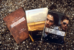
Before he launched his design career, Marc English studied music composition and arrangement at the Berklee College of Music. Now the founder of Austin-based Marc English Design, he recently found an unlikely similitude between design and the musical pursuit of his previous life. Speaking about his DVD packaging for Gus Van Sant's My Own Private Idaho, English says: "That's exactly what this was. This was composing and arranging someone else's photography to help tell a story in print that's actually told on film."
In fact, there is a musical quality to the packaging, which includes a book, two DVDs, and slip-case. The design cross-references the movie's themes - which include narcolepsy, homosexual prostitution, and Shakespeare's Henry the IV - as if the package were a contrapuntal, albeit visual, arrangement. Throughout the 60-page book, English's decorative fonts, which evoke the 17th century in which Shakespeare wrote, play against contemporary stills from the film. On one spread, a Q&A from Interview Magazine, that evangelist of modernity, sits on the pages like a folio of a Shakespearean play.
Juror DJ Stout, partner at Pentagram in Austin, was impressed by English's attention to detail, each of which, he says, "is cared for." One of the more provocative details among these "cared for" elements appears on the cover. In the center of a decorative "O" that completes the word, "Idaho," is the rendering of a bent-over (look closely) cherub. "He's offering up his portal," says English, with relish, "which is partially what the film is about."
English's references to antiquity don't merely ape the vernacular of a bygone era; his sources are authentic. The book's cover has the texture of worn leather, which comes from a scan of an 1853 psalmody. That ribald O is a real Venetian letter form, circa 1500, while the flourishing "P" that appears throughout the book was designed by Nurnberg's Paulus Franck-Schatzkammer in 1601. "What he's done," says Stout, "is reinterpret these classical elements in a very contemporary way, which is admirable. It's easy to study up on a classic look and imitate the genre. But none of this is decorative trickery. He's communicating something more."
------------------------------
"A longtime 'Idaho fan' (although not a 'fanatic') and that's how I came across the packaging. It is one of the most beautiful designs I have seen, and also perfectly conveys the many essences of the movie - in fact, in some ways I like it better than the movie itself! (is it heretical to say that?) I only wish my other favorite movies received such lavish packaging treatments. I live in Seattle, one of the 3 locations featured in the movie."
Kestral Windhover
Seattle