AFS | Austin Film Society
 AFS | Austin Studios
 AFS | Quentin Tarantino Film Fest
 AFS | Slacker 2011
 AFS | Texas Film Hall of Fame 09
 AIGA | Design Ranch
 AMF | Love Austin Music
 Acran
Acran Alereon
 Alliance Abroad Group
 Arc Reps
 Austin Museum of Art Guild
 Cambridge Friends School
 GirlStart
 H2Hos
H2Hos Internet Police Alliance
 KIRK
KIRK Kinsei
 La Sonrisa Productions | Inside The Circle
 Lake Hills Church
 Marc English Design | Since 1993
 Mass. Association of Bank Council
 Mountain Crossings at Walasi-Yi
 Rancho Pancho
 Sharing Technologies
 Texas Film & Cattle Co.
 Texas Writers Month
 Thokozani
 Troublemaker Studios
 Tsogolo La Thanzi Centre
 UT/Austin | School of Architecture
 Unnatural Axe
 ABC-TV | Healthy Start / Healthy Babies
 ACADIA: Suicide, Sex & Success
 AFS | 20th Retrospective
 AFS | Essential Cinema
 AIGA Atlanta
 AIGA Austin | Love | Work
 AIGA Baltimore
 AIGA Birmingham
  AIGA Boston | Touch of Power
 AIGA Charlotte
  AIGA Honolulu
 AIGA Houston | Doug Sahm
 AIGA Iowa | Fertilizing Minds
 AIGA Las Vegas
 AIGA Miami
 AIGA Nashville
  AIGA Omaha | The Wolves of Texas
 AIGA Philadelphia
 AIGA Washington, D.C.
  Angels You Left
 Art Directors Club of Tulsa
 Auburn University
 BF/VF | Laurie Anderson
 BF/VF | MIra Nair
 Green Room Pictures
 HOW Design Conference 2007
 La Sonrisa Productions | Inside the Circle
 Manufacturing Dissent
 NWAADC Perspective
 NWAADC Step No. 3: O.B.E.
 Quinto Malo Films | One Minute to Nine
 Ransom Center | Avant Garde Film
 Ransom Center | Brit Noir
 Ransom Center | Voyages
 Texas Film Hall of Fame
 Texas Writers Month | 1997 | O. Henry
 Texas Writers Month | 1998 | Porter
 Texas Writers Month | 1999 | McMurtry
 Texas Writers Month | 2000 | McCarthy
 Texas Writers Month | 2001 | Kelton
 Texas Writers Month | 2002 | Carpenter
 Texas Writers Month | 2003 | Dobie
 Texas Writers Month | 2004 | Michener
 Criterion | Border Radio
 Criterion | Dazed and Confused
 Criterion | My Own Private Idaho
 Criterion | Naked
 Criterion | Slacker
 Criterion | Two-Lane Blacktop
 Criterion | Walker
 Honora Jacob
 Internet Police Alliance
 Kinsei
 Legacy Trails
 MARK Skateboards | website
 Site59
 AFS | 20th Retrospective
 AFS | Austin Studios brochure
 AFS | Texas Film Hall of Fame
 Austin Chronicle | English: 2nd Language
 Austin Film Society | PoV
 Austin Museum of Art Guild
 Chronicle Books | Cooking Up A Storm
 Chronicle Books | Where Flavor Was Born
 City of Austin | Create Austin Cultural Plan
 Four Hands
 Houghton Mifflin | About Language
 Indigenous Art of Coahuila
 Inspirational Hollywood
 Massachusetts College of Art | Compton
 Meta Design
 Rockport Publishers | Designing Identity
 Texas Fine Art Association | Pulp Fictions
 Texas Fine Arts Association
 Texas Writers Month
 The Art of Beowulf
 UT Department of Education
 UTSoA | Planning Forum
 Vtel
Vtel Xetel Corporation
  AFS | Essential Cinema
 AFS | Fundraising Invitation
 AFS | Make Watch Love Film
 Arts Alliance America | Inning By Inning
 Booker Music | Craig Hella Johnson
  Boston Brownies
 Criterion | Border Radio
 Criterion | Dazed and Confused
 Criterion | Naked
 Criterion | Slacker
 Criterion | Two-Lane Blacktop
 Criterion | Walker
 Dr. Dreams Juice Machine
 LOL
LOL La Peste
 MARK Skateboards | decks
 Merchants of Venus
 The Good Seeds
  The Stains
 Two Mule Records
 Whole Foods Market | 365 Pasta | bag
 Whole Foods Market | 365 Pasta | box
 Whole Foods Market | Belgian Chocolates
 Whole Foods Market | Pasta
 Whole Foods Market | Pasta family
 Whole Foods Market | Seasonal Specialties
 Whole Foods Market | Truffles
by Wayne Allan Brenner
[The Austin Chronicle, September 8, 2000]
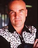
Marc English, rock star. That's the impression you get after only a few minutes with him. The boldness and certainty with which he talks, with which he moves, the way he proceeds through a series of intricately linked jump-cuts while rhapsodizing about his work and the work of respected others. He's enthusiasm embodied, this tall guy in denim pants and white shirt, and his energy is backed up with a deep knowledge of design and its history. He's had classes in it (BFA from the Massachusetts College of Art), he's taught classes in it (as adjunct professor at his alma mater, and Southwest Texas State University, and elsewhere), he's even written an instructive and entertaining book on it (Designing Identity: Graphic Design as a Business Strategy). But he's been interested in the field for a much longer time.
"I got this album when I was 10 years old," he says, holding up a copy of the Beatles' Revolver, the album covered with finely lined pen-and-ink portraits of the Fab Four. "The cover's by Klaus Voorman, a German who hung out with the Beatles in Hamburg. And when I was a little kid, I was holding the album while listening to the songs over and over and over again - which is what you do when you're that age. And I'm looking at these illustrations and the photographic collage, and it's great. And then I'm in junior high and I can take my bicycle into Harvard Square - it's a little Stingray bike - and ride around and look in the record stores. And right next to the records are the books - the art books. And I see line drawings by Aubrey Beardsley much like the Revolver cover, and naked girls - and where else can you see, y'know, bare breasts in junior high and get away with it but in art books? And years later, I realized that the Beardsley stuff came from the influx of Japanese art into the West during the 1800s - when Beardsley was around. And I didn't know that back then, when I was 10, of course. But that's how I first got into it - from looking at my Beatles albums. The White Album with its embossed cover. Sgt Pepper's. So I - " he laughs, shaking his head " - I owe everything to John, Paul, George, and Ringo."
English did the whole rock & roll thing himself for years, after high school, attending the Berklee College of Music in Boston and playing in a series of low-impact bands. Eventually, he burned out. "I didn't feel like starving anymore," he says. "I saw too many people doing that kind of thing, the whole band living together in one house with a big box on the floor, two feet by two feet, filled with elbow noodles." So back he went to visual art.
Fast forward through the college years and past them: through stints as president of the Boston chapter of the American Institute of Graphic Art (AIGA); through almost two decades of graphic creations to promote the likes of Laurie Anderson, Houghton Mifflin, VTEL, Hoodoo Barbeque, Sun Microsystems, and locals Cinemaker Co-op, AIDS Services of Austin, and others; through the resultant citations and awards for excellence in design; through - on the personal side - a marriage and divorce that's left him with, at least, a Texas address and a wonderful daughter to share the cool things of the world with.
These days, English is hard at work in his studio on Goodrich Avenue. Well, he's taking some breaks - to speak at various symposia (he's on the national board of the AIGA, after all), to attend art openings (he has an upcoming exhibition of his work at the Universidad Autonoma Metropolitana in Mexico City), or just to explore different parts of the world (like Morocco and Tangier, where he recently experienced and photo-documented the culture once inhabited by his literary idol, Paul Bowles). More often, though, he's at the drawing board, even literally, conjuring light and shadow, paper and pen, mouse and software, in ways that result in stunning design for all manner of public and private endeavors. He's just completed an annual report for XeTel Corporation - vividly full-color, with multiple die-cuts and intricate production manueverings - and he's working on new identity systems for GirlStart and the Austin Film Society, not to mention hammering out a deal with an international aeronautics company that . . ..
Well, he's doing what he does best. His Cormac McCarthy poster for Texas Writers Month matches, in intensity and lyricism, the blood-soaked text it illuminates. His work for the Salvage Vanguard Theater production of David Bucci's Altamont Now - the main image is English's own booted foot stepping on the wrist of his young daughter, flowers falling from her opened hand - is something memory won't soon release.
And English is not unwilling to go on about these things. There's little humility from him, false or otherwise, but neither is there any lame boasting. Nor is this former Bostonian reticent on the merits of others; he holds the work of David Kampa and D.J. Stout in such high esteem, for example, that those men would likely be his heroes if they weren't already his friends. And the idea that his work will soon be shown in Mexico City, in the same place that's exhibited the work of Paul Rand, makes him grin like a fiend. He's glad to point out what works locally, too, as far as corporate identity is concerned: The Ace Custom Tailors sign, the logo for the new airport, the Taco X-press storefront on South Lamar. (Maria's Tacos, he calls that last. "My studio used to be across the street from them; I used to walk there all the time for lunch. Now it's so crowded, you can hardly find a place to eat. But you know what? I've got the sign they used to have, the old one. It's in my kitchen at home.")
All perfect embodiments of what those companies do and how they do it, sayeth the Design Shaman. "And Waterloo Ice House on 38th," he adds, gesturing to the north, his wrists obscured by various bands of silver, of copper, of finely wrought metal. "They've got those canoes. A row of canoes upended, way off the ground, cut in half, bright colors inside. All these things, the signs and other elements that talk about what's going on in a place and who the customers are - it's a visual language. And that's what we keep going back to."
Sure, but what if that language is ill-used? "I'll tell you," says English. "We have a client - who I won't name - and their logo sucks." He frowns, as if the offensive item has just materialized before him. "It really sucks, and we didn't do it. And you talk to them, and they don't understand why it sucks, but the attitude seems to be 'Well, it's worked so far . . .' And to me, that's not good enough. If you want to differentiate yourself, you have to be superlative. And you have to be superlative not only in your product, but in your promise - which is the signage and other visuals, the graphic identity that provides first impressions to your audience. If design is going to succeed in communicating, in product packaging, it's got to add something more. It's got to add something that enhances life."